Friday, April 16, 2010
Wohlfahrt Etude 3 Opus 45
Etude 3 is in G Major with the F being sharp. This affects the first finger on the E string as well as the second finger on the D string. The sixteenth notes can look intimidating at first but you don't need to take it too fast but maybe a bit faster than the first two etudes (I believe I did and had to focus to get it right); the Moderato tempo helps here. The etude starts with the 4th finger that is worth checking with the open E to ensure correct intonation. Open E appears also in this study... Open strings will always sound a bit more brilliant than when played with the 4th finger. Alternating an open string with the 4th finger in the first position is a good thing to do to compare the sound and correct the finger position.
Thursday, April 15, 2010
Wohlfahrt Etude 2 Opus 45
Etude 2 is, like its predecessor, in the C Major key with the same moderato tempo (in other words, it doesn't have to be too fast). The most noticeable change here is the presence of accidentals (the F sharp). As the previous etude, the intervals are still close but get larger from time to time. The frequent use of the 4th finger is not hazardous, I believe the intention is to exercise the pinky in this study (like it was done in Etude 1).
Wednesday, April 14, 2010
Wohlfahrt Etude 1 Opus 45
Etude 1 is in the easy C Major key and is like a ride on the C Major scale with few close intervals and arpeggios here and there in an up and down melodic line form. This helps actually checking intonation and the exercise runs in the first position. Notice also the frequent use of the 4th finger (the pinky little finger) that you can constantly check with the open string for the most accurate intonation.
Wohlfart Etudes Opus 45 Mini Project
I decided to work on Wohlfahrt etudes and tape them as a self-reflection and judgment and to share with other learners. This practice helps me actually better understanding these studies and their challenges in order to make improvements.
Opus 45 is probably the one that is mostly studied for its variety of techniques and gradual exercises. I like playing these etudes for their versatility, bowing diversity and melodic lines.
Tuesday, April 13, 2010
Designing a Concert Poster
 My involvement with amateur orchestras goes beyond the musician role. With a graphic design background, I enjoy designing concert posters and programs. However, since I do this on a voluntary basis, I have some conditions that I share with my fellow musicians and orchestras committees.
The main condition is to give me the full freedom in terms of design. This provides flexibility to let my imagination flow and I don’t have to face a client requirement or multiple changes. The worst is when sometimes a client plays the role of a designer and gets involved in the design, making decisions on how the items are displayed that don’t respect the basics of layout.
Even with the flexibility I mentioned, once a draft is previewed by more than 5 people, I get sometimes 5 different opinions, likes and dislikes, etc. People’s tastes are very different and I respect the opinions and ideas that come my way. I try to balance the flow of feedback and work on leveraging-up the design where I believe it is necessary.
Since these posters are designed for different concerts and the musical season is not really announced ahead of time, I try to have a unique poster for each concert instead of a series of similar posters.

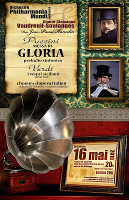
 The latest poster I worked on is an all Italian program with the OPMM (Orchestre Philharmonia Mundi de Montreal) featuring Puccini early work (Messa di Gloria & Preludio Sinfonico), opera choruses and a Verdi overture. I wanted a warm design, something a bit retro in style as if it is a corner in an old Italian home. A little note on the program... I actually love this Gloria; you sense the “future” Puccini in this music. The “preludio” is pretty nice too!
Finally, the purpose of these concert posters is more informative than a marketing campaign. I favour artistic designs or even photography over a plain informative sheet of paper.
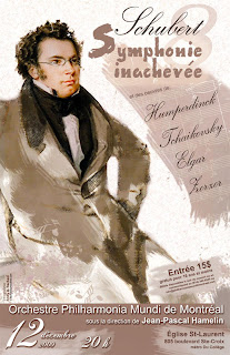
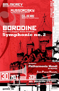
In contrast with the Italian program poster, the Russian program poster of last year was a blend of red and Russian fonts. As for the Schubert Unfinished concert, an unfinished portrait of the composer was featured; a kind of a drawing in progress on a canvas.
